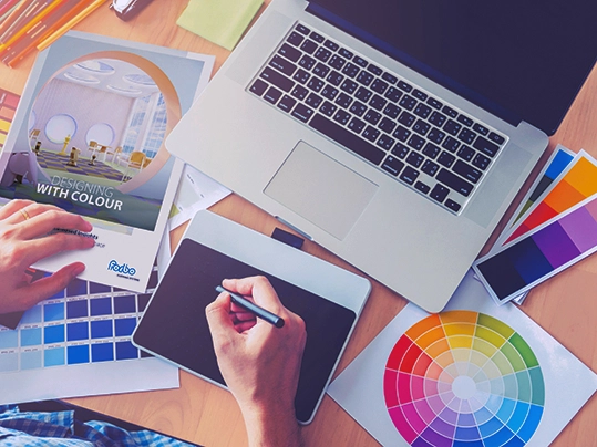
The power of colour in design
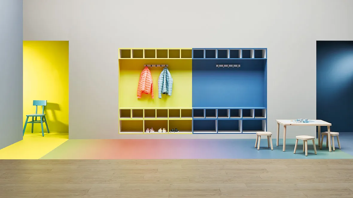
In the world of interior architecture, colour isn’t just an aesthetic choice. It’s a spatial tool that shapes how we feel, behave, and move through a space. For architects and designers, understanding the psychological and emotional impact of colour is essential to creating environments that support wellbeing, clarity, and identity.
"Colours act on the soul, they can excite sensations, awaken emotions of ideas that rest or agitate us and cause sadness or joy."
— Johann Wolfgang von Goethe, Theory of Colours (1810)
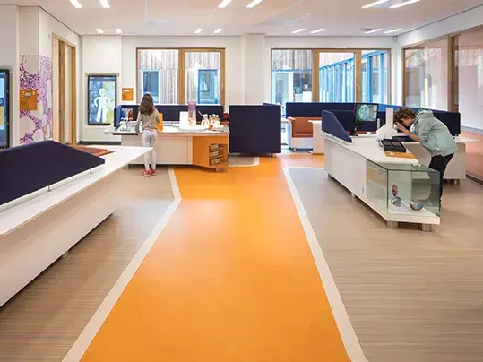
From Goethe’s early theories to today’s scientific studies, colour psychology consistently shows that colour influences mood, focus, and even physical health. Warm tones can energise a space and encourage interaction, while cooler hues like green and blue promote calm and clarity. This is especially important in schools, hospitals, and offices.
Beyond mood, colour also shapes how a space functions. It guides movement, improves accessibility, and subtly influences behaviour. Colour-coded wayfinding floors in hospitals or strong wall-to-floor contrasts in dementia-friendly designs are just a few examples. Understanding these emotional and behavioural associations is key to creating spaces that feel as good as they function.
Flooring is one of the most important surfaces in any room. It grounds the design and plays a big role in how a space feels and functions. Because people interact with the floor more than any other surface, it becomes a key way to turn colour theory into something real and practical.
We believe flooring is an essential part of every interior colour palette. A soft green floor in a hospital corridor can support both healing and wayfinding. A vibrant red floor in an active zone, such as a school breakout area or a creative workspace, can stimulate energy and encourage movement.
When combined with the right material, colour can help create calm, signal safety, or boost energy. Flooring also defines different areas, improves acoustics, and helps guide people through a space using both colour and texture. That’s how it supports spaces that are functional and emotionally engaging at the same time.
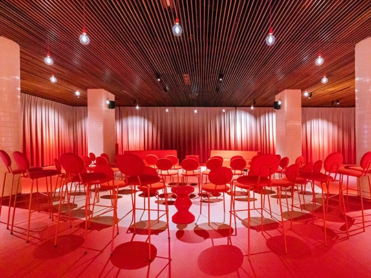
To apply colour psychology with purpose, Forbo Flooring developed the Dynamics of a Building framework. It breaks interiors down into five core space types, each with distinct emotional needs and design goals.
Receiving
These include lobbies and reception areas. As the transition between outdoors and indoors, they benefit from natural colours — green, blue, and yellow — that reflect nature, sky, and sunlight. These tones build a sense of calm and connection, especially when paired with glass to maintain visual links with the outside. Receiving areas are also perfect for expressing brand identity through colour, helping the space feel both welcoming and recognisable.
Moving
Corridors and transitional spaces should support orientation and flow. Colour guides people naturally, especially when used alongside signage, floor markers, or simple symbols. Vibrant accents can highlight routes or signal different levels or departments. In large buildings such as schools or hospitals, this makes wayfinding easier and more intuitive.
Connecting
Interaction, collaboration, and informal breaks happen in these areas — from lounges to shared breakout zones. Colour zoning can subtly
define these spots without walls, especially in open-plan layouts. A layered palette combining warm tones with cooler hues creates a balanced environment that encourages both conversation and comfort.
Concentrating
Workspaces, study zones, or consultation rooms call for calm, low-stimulation palettes. Soft greens and blues promote focus, productivity, and a sense of peace. These tones minimise distractions and help people stay mentally centred, which is particularly valuable in professional and educational settings.
Recharging
Lounges and wellness areas offer moments of pause. These spaces benefit from soft, nature-inspired colours like pastels, turquoise, and neutrals. These tones reduce stress and promote emotional recovery, especially when combined with tactile materials and soft lighting. Colour helps signal that this is a space for slowing down and taking a breath.
This framework helps designers align colour choices with purpose. The result is spaces that are not only well organised but also emotionally in tune with how people feel and function.
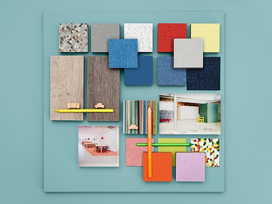
While trends in interior colour evolve, the connection between colour and wellbeing remains strong. Goethe viewed colour as a mirror of emotion, and that philosophy still shapes how designers work today. Colour is no longer just about aesthetics. It's also about supporting human needs, improving accessibility, and designing for health and inclusion.
Flooring plays a major part in this. As one of the most continuous and visible surfaces in a space, the floor carries the colour palette from one zone to the next. It defines transitions, supports navigation, and sets the emotional tone. Whether you're designing for a hospital, office, school, or public space, the colours you choose for flooring express identity, guide movement, and influence the way people feel.
We’ve captured all of these insights, along with practical examples, scientific references, and design inspiration, in our whitepaper 'Designing with Colour'. Developed in collaboration with colour expert Mélanie Bernard, it offers a comprehensive guide for architects, designers, and anyone exploring the connection between colour, space, and wellbeing.
Read or download the whitepaper here
