Pantone: The Future of Colour
Carola Seybold, Director of Business Development at Pantone
January 2020
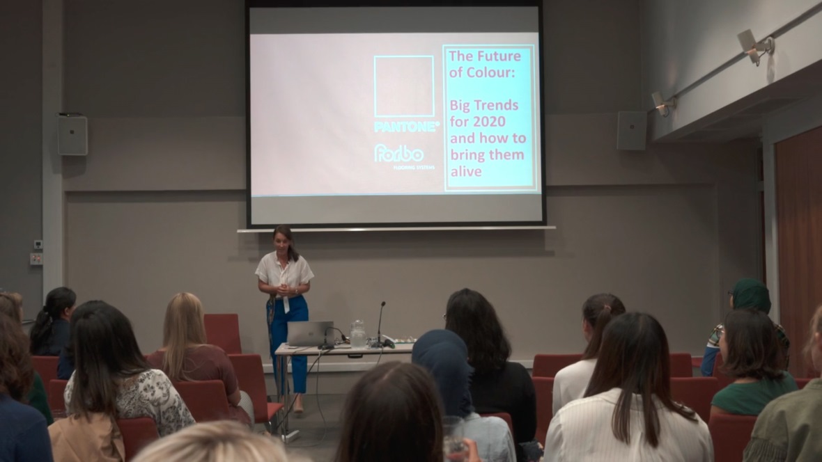
In September last year, we organised a series of Pantone Colour Workshops across the UK, with the purpose of giving architects, specifiers and interior designers an insight into the future of colour within workplace design. If you missed it, don’t worry, as in this blog we’re taking a look at the big trends for 2020, as presented by Carola Seybold, Director of Business Development at Pantone.
One of the big trends for this year will be rapid change. Boundaries in all aspects of our lives have blurred, the ground on which we are standing on feels less solid and nothing is the same as it was a year ago. Before, if something was changing in our economy, it was a slow change, but now things are moving more quickly.
As such, we will see reality and the digital world merge together. For example, digital installations will be used to inspire our imagination. We can also expect to see experiential visuals as the distinction between what is real or virtual is no longer as hard edged as it once was. From a colour and design perspective, the reaction to digitisation and automation is coming through in our attraction to iridescent and metallic finishes.
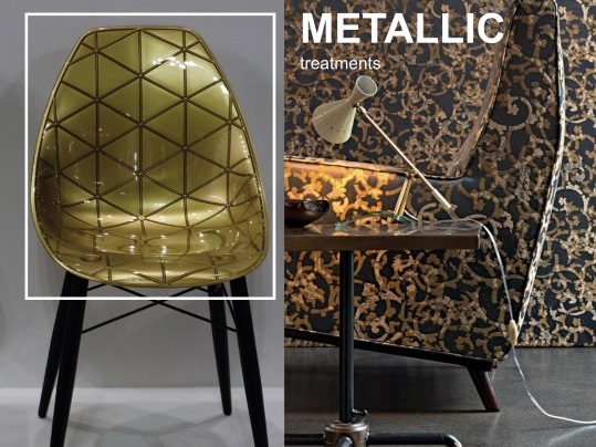
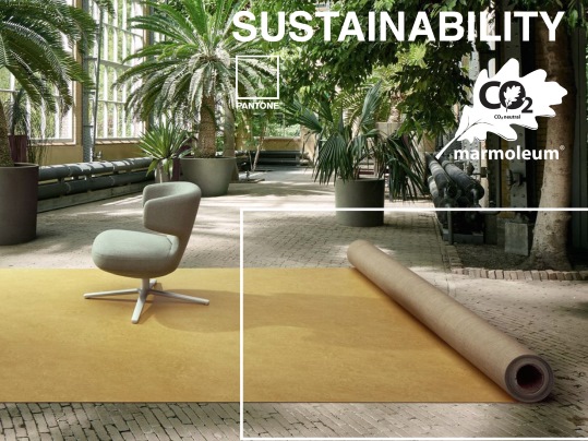
What’s more, the more high tech we become, the more we look to nature to help us keep balance in life, which is why we will continue to see products directly reflecting nature’s green tones. In workplace design, through the use of green floors for example, this can help us to synchronise with nature and bring the outdoors inside, which can make a space more exciting.
Sustainability is not a new trend but it will certainly become more important year on year. The growing challenge to find ways of balancing consumerism with environmental concerns is leading to creative solutions in material construction, with products such as Marmoleum playing a key role in flooring. And because of this sustainability trend, florals will also become more dominant in design, whether that is vibrant, pastels or muted floral patterns.
Colour is the main driver of consumer behaviour, whether that it is food, fashion, products, textiles or interiors. In fact, purchasing decisions are made in a matter seconds - anywhere between two to seven, to be precise. Colour delivers emotion, creates association, supports global brand recognition and wellbeing and every year, we see colours take different directions.
In 2020, office design will move away from strong reds and instead, we will see the colour being characterised with a hint of orange, an infusion of pink or even brown. In pink, we will see more gradations and muted or dusted pinks, as well as vibrantly bright or romantically inspired shades with a sparkling presence. The use of orange and brown will become more burnished and the warming presence of metallic shades will create opportunities for some more interesting colour mixes.
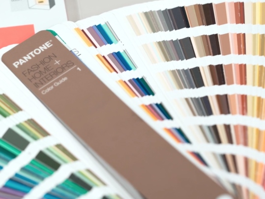
For yellow, the warming presence of Spicy Mustard in one end and the matcha-toned Shadow Green on the other end of the spectrum shows that there will be a wide range of yellow shades used throughout 2020.
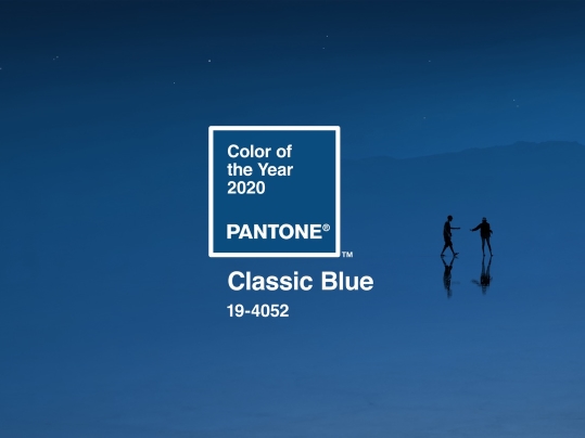
Greens and sea blue greens will continue to inspire in 2020, following the trend of nature. While Sky Blue and Cobalt Blue will attract attention, along with the Pantone Colour of The Year Classic Blue. Indeed, we can certainly expect to see the timeless and enduring blue hue take shape within workplace design over the next year.
For the more netural colours such as white, grey and black, metallic shimmers bring a new importance to this colour range, suggesting inventive approaches to traditional design and classic approaches to innovation.
Colour defines our world, it is visible from a greater distance than any other element, such as copy, shape and graphics, and that’s why it is important to understand how colour will be evolving this year. Thank you to the Pantone team for delivering some fascinating workshops - we are looking forward to seeing how these trends take shape over the course of the year.