Pantone Color of the Year 2022
December 2021

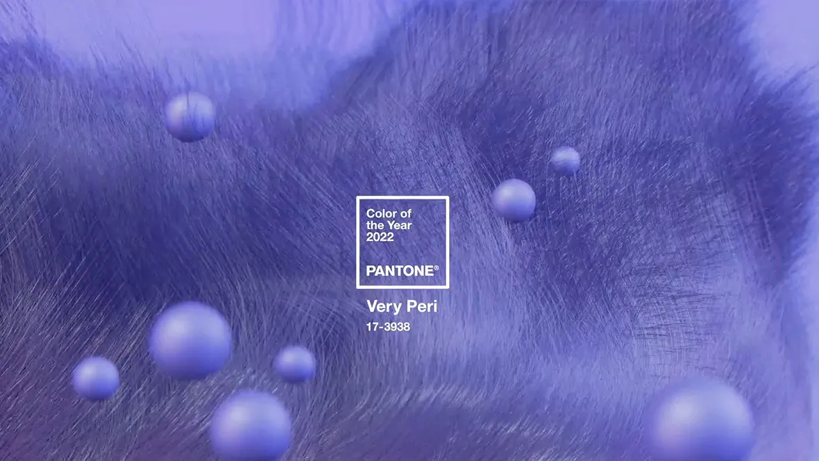
Pantone has announced its Color of the Year 2022: PANTONE 17-3938 Very Peri. According to Pantone it's a vibrant color that displays a spritely, joyous attitude and dynamic presence that encourages courageous creativity and imaginative expressions. We asked Dorothé Kessels, our Global Director Design, about her thoughts on this new Color of the Year.
For over 20 years, Pantone’s Color of the Year has influenced product development and purchasing decisions in multiple industries, including fashion, home furnishings, and industrial design, as well as product packaging and graphic design.
The selection process requires thoughtful consideration and trend analysis. To arrive at the selection each year, Pantone’s color experts at Pantone Color Institute comb the world looking for new color influences.
This can include the entertainment industry and films in production, traveling art collections and new artists, fashion, all areas of design, popular travel destinations, as well as socio-economic conditions. Influences may also stem from new technologies, materials, textures, and effects that impact colour, relevant social media platforms and even upcoming events that capture worldwide attention.
"Displaying a carefree confidence and a daring curiosity that animates our creative spirit, inquisitive and intriguing PANTONE 17-3938 Very Peri places the future ahead in a new light", as Pantone describes it. "We are living in transformative times. PANTONE 17-3938 Very Peri is a symbol of the global zeitgeist of the moment and the transition we are going through. As we emerge from an intense period of isolation, our notions and standards are changing, and our physical and digital lives have merged in new ways".
“The Pantone Color of the Year reflects what is taking place in our global culture, expressing what people are looking for that color can hope to answer,” added Laurie Pressman, Vice President of the Pantone Color Institute.
“As we move into a world of unprecedented change, the selection of PANTONE 17-3938 Very Peri brings a novel perspective and vision of the trusted and beloved blue color family, encompassing the qualities of the blues, yet at the same time with its violet red undertone, PANTONE 17-3938 Very Peri displays a spritely, joyous attitude and dynamic presence that encourages courageous creativity and imaginative expressions.”
Leatrice Eiseman, Executive Director of the Pantone Color Institute

Dorothé Kessels, Director of Global Design:
PANTONE 17-3938 Very Peri is a blue-violet colour positioned towards the far end of our visible colour spectrum almost intangible and close to ultraviolet.
Ultraviolet translated as "beyond violet" (from Latin ultra, "beyond") can be described as a blue with violet-red undertones. Though for most humans invisible, there are some insects such as bumblebees, that can see ultraviolet.
Color, as we experience it in our material world, is defined by light reflection and absorption. The new Pantone colour of the year closely relates to the appearance of color in digital environments defined by light radiation. This merging of material and digital worlds symbolizes new perspectives and challenges in a post-Covid world.
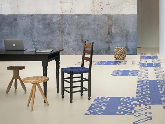
Translating the vibrant blue-violet colour into a tangible flooring product generates a surface with a solid appearance and outspoken colour identity. Usually, the blue-violet items in our collections function as accent colours to make a bold statement or as an eye-catcher.
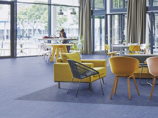
While being applied in a space this versatile color can work like a chameleon shifting between a warm and a cool atmosphere depending on the colors and materials it is surrounded by.
Being part of a color scheme this color is a grateful component for unusual and distinctive color combinations. Used as an accent color it can add freshness and vitality to any space.
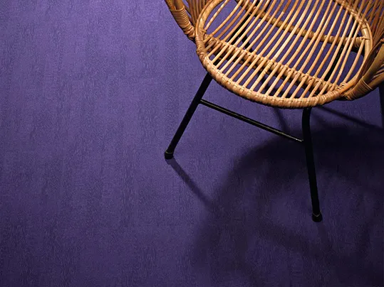
Marmoleum Marbled violet, with its organic blend of blue and red tones, perfectly represents the creative imaginative human nature. It can be the bold focal point in a room, or used as a delightful colorful element, accenting either a neutral shade or another striking hue.
With its subtle texture and color variation, Flotex Calgary condor brings a softer muted ambiance to a space. The grained appearance allows a natural shift between the primary blues to the understated hint of reds. Combined with Marmoleum, it brings a much needed comfort and calm atmosphere to a space where invention can take place.

