Pantone Color of the Year 2026
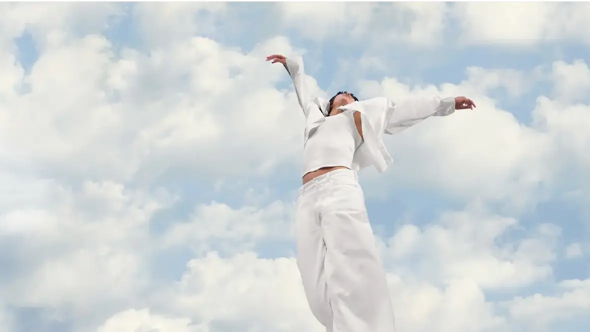
The Pantone Color of the Year 2026 is PANTONE 11-4201 Cloud Dancer, a soft, luminous shade of white symbolizing a collective return to calmness, clarity and contemplation. It allows the mind to wander and creativity to flourish.
The Pantone Color of the Year programme sparks conversations about the profound connection between colour and culture. Each year, the chosen hue reflects extensive cultural research, capturing global moods and trends in design, entertainment, art, and fashion. The result is a single defining shade that embodies the spirit of the times.
Laurie Pressman, Vice President of the Pantone Color Institute : "This precise shade of white, chosen for its careful balance of cool and warm undertones, was selected with intention, she explained. It reflects a sense of honesty and authenticity, yet it also hints at sterility and isolation through its coolness”.
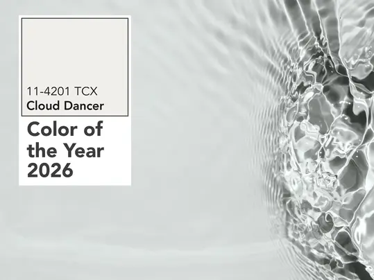
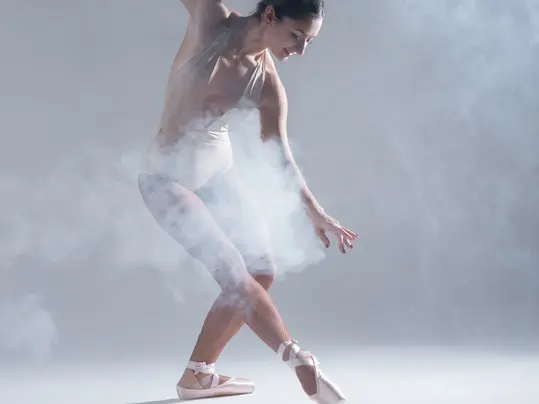
PANTONE 11-4201 Cloud Dancer evokes a sense of height and lightness. It provides an elevated perspective, removed from chaos and grounded in calm. White represents purity and innocence. Treating it as a neutral colour is one of the most important tools in interior design, as it can be used with any style. When used in combination with various other shades of white or other light neutrals, such as grey, beige or taupe, it can also convey a sense of simplicity and minimalism.
The Pantone colour of the Year, Cloud Dancer, reflects a growing desire for light, open and calming interiors. Designers and architects often prioritize light colours because they make spaces feel larger, more open, and more inviting.
Light and open environments encourage relaxation, support emotional balance, and provide visual relief from the overstimulation of modern life.
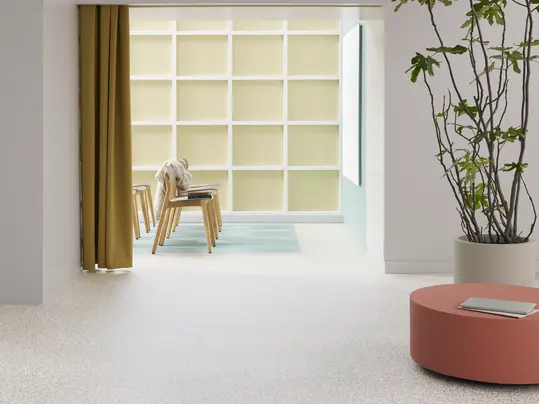
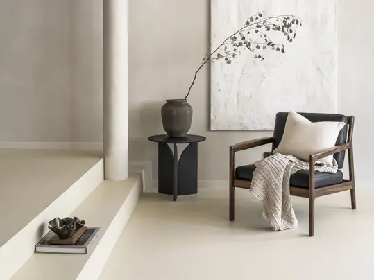
Favoured by architects and designers, this pure, airy white enhances brightness and creates a sense of spaciousness and serenity. In addition, brighter interiors have been shown to enhance mood and well-being while reducing the need for artificial lighting, helping to lower energy consumption.
White also serves as a neutral canvas, allowing other materials, textures, and architectural elements to stand out.
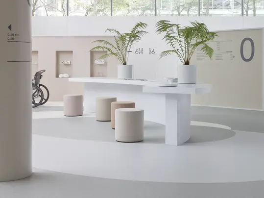
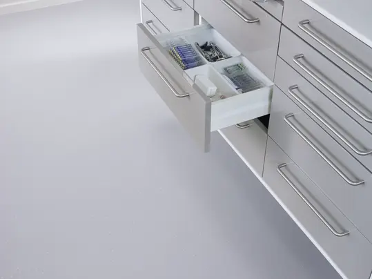
“White flooring presents unique challenges due to its vulnerability” says Dorothé Kessels, Director of Global Design at Forbo Flooring Systems. However, in environments where cleanliness, brightness and hygiene are desired, such as healthcare facilities, white flooring can be highly functional. It creates a sense of sterility and contributes to a clean, controlled visual atmosphere.
Off-whites provide a softer alternative, bringing warmth and elegance to interior spaces while retaining their light-enhancing qualities.
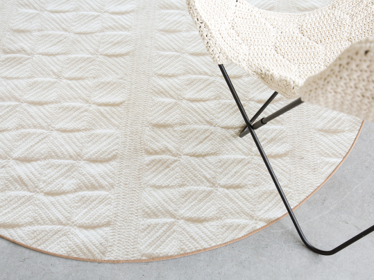
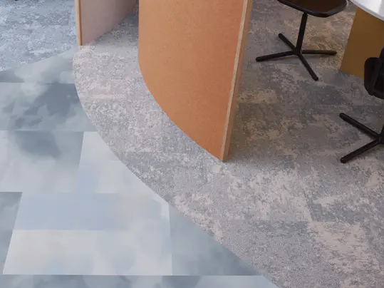
Pairing whites with soft textures creates a calming, uplifting space that reflects the growing preference for natural, organic interior design as showed in our Mood of the Season EIGHT | Forbo Flooring Systems
Across many flooring collections, a true white shade remains highly popular and in consistent demand. This is particularly important in ranges like homogeneous vinyl, which are commonly specified for healthcare and industrial environments. In contrast, whites in our Marmoleum range, such as White Chocolate tend to feel slightly warmer due to their natural ingredients. With Flotex, printing on a white base helps to enhance the soft, warm character of the material.
