Pantone Color of the Year 2022
December 2021

“As we move into a world of unprecedented change, the selection of PANTONE 17-3938 Very Peri brings a novel perspective and vision of the trusted and beloved blue color family, encompassing the qualities of the blues, yet at the same time with its violet red undertone, PANTONE 17-3938 Very Peri displays a spritely, joyous attitude and dynamic presence that encourages courageous creativity and imaginative expressions.”
Leatrice Eiseman, Executive Director of the Pantone Color Institute
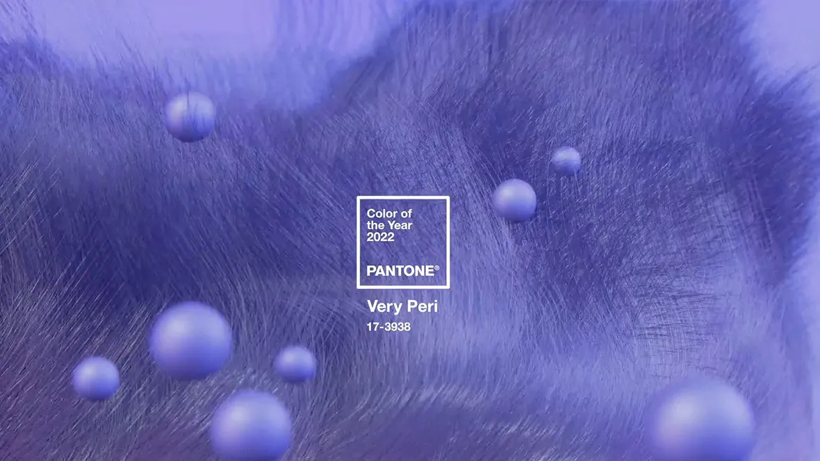
2022 marks the first time Pantone has created a new shade in its 23-year history of choosing a colour of the year. According to the institute, creating a new colour for 2022 was itself symbolic of the changes taking place in the world right now, following an intense period of isolation and uncertainty.

Pantone has announced its Color of the Year 2022: PANTONE 17-3938 Very Peri. According to Pantone it's a vibrant colour that displays a spritely, joyous attitude and dynamic presence that encourages courageous creativity and imaginative expressions. We asked Dorothé Kessels, our Global Director Design, about her thoughts on this new Color of the Year.

Dorothé Kessels, Director of Global Design:
PANTONE 17-3938 Very Peri is a blue-violet colour positioned towards the far end of our visible colour spectrum almost intangible and close to ultraviolet.
Ultraviolet translated as "beyond violet" (from Latin ultra, "beyond") can be described as a blue with violet-red undertones. Though for most humans invisible, there are some insects such as bumblebees, that can see ultraviolet.
Colour, as we experience it in our material world, is defined by light reflection and absorption. The new Pantone colour of the year closely relates to the appearance of colour in digital environments defined by light radiation. This merging of material and digital worlds symbolizes new perspectives and challenges in a post-Covid world.
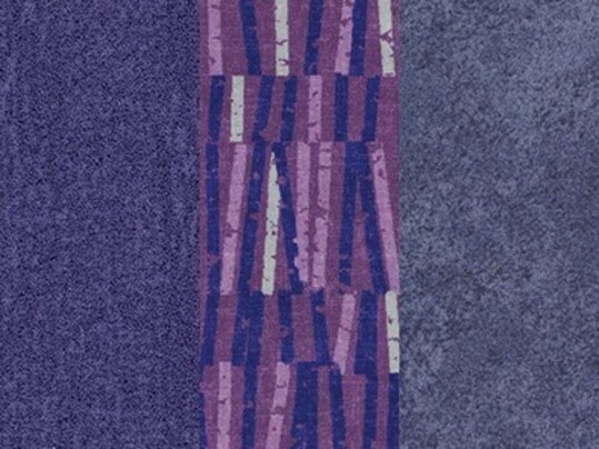
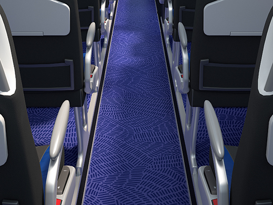
Translating the vibrant blue-violet colour into a tangible flooring product generates a surface with a solid appearance and outspoken colour identity. Usually, the blue-violet items in our collections function as accent colours to make a bold statement or as an eye-catcher.
While being applied in a space this versatile colour can work like a chameleon shifting between a warm and a cool atmosphere depending on the colours and materials it is surrounded by.
Being part of a colour scheme this colour is a grateful component for unusual and distinctive colour combinations. Used as an accent colour it can add freshness and vitality to any space.
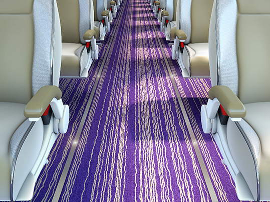
There are many different floor covering products available within the rail, marine, bus and coach portfolios. However, in addition to the existing references, we offer bespoke design services alongside many of our products, allowing you to either create your own flooring masterpiece from scratch or to start with existing designs and to recolour in order to match your interior design requirements perfectly.
Find out about the endless design opportunities that Forbo Flooring Systems can offer for your next rail, marine, bus or coach project by clicking here.
